Style Guide
How Colors in Tarot Cards Shape Every Reading
Look closely at The Empress and you'll notice something: that golden sky isn't decorative. It's doing work. Color carries meaning through every card in a tarot deck, from the reds that warn of passion or conflict to the blues that quiet the mind toward reflection. This guide breaks down what each color signals, why certain palettes repeat across suits, and how to read the details most people miss entirely.
Climate scientist, ashtanga practitioner, and advocate for human rights and LGBTQIA+ equality.
Your eye reads the card before you do
You flip a card and your stomach tightens. The figure hasn't registered yet, the Roman numeral at the top is still just a shape, but something in the color has already landed in your body. A wash of red and you sit up straighter. A field of grey-blue and your shoulders drop half an inch. This happens every single time, whether you've been reading for twenty years or twenty minutes.
Color operates underneath naming. Your visual system processes the wavelength, routes it through memory and emotion, and delivers a verdict before the slower part of your brain catches up and says, "Oh, that's the Tower." By the time you're reading the guidebook entry, your nervous system has already cast its vote. And that vote shapes everything that follows. The intellectual meaning you assign to a card gets filtered through the felt sense the color produced first. You don't override that initial reaction. You build on top of it.
This is not an accident. The colors on tarot cards form a parallel language running underneath the imagery, one that was built deliberately across centuries of artistic and occult traditions, further shaped by printing constraints. When the Rider-Waite-Smith deck blankets the 10 of Swords in a sky the color of a bruise turning yellow at the horizon, that gradient is doing narrative work. It tells you the worst is already passing. You don't need the book to feel it.
But here's where it gets genuinely strange. The same red doesn't always do the same thing. Scarlet next to gold feels celebratory. Scarlet next to black feels like a warning. The perceptual instability of color, the way its meaning shifts depending on what surrounds it, is exactly what makes it so useful in a system built on contextual interpretation. A tarot spread is a sentence made of images, and color is the tone of voice. You'll start to notice this everywhere once you know what to look for, especially in court card personalities, where a single figure's robe color can flip the entire meaning of a reading.
Think about the last card that stopped you mid-shuffle. What color dominates it? Hold that answer. We're coming back to it.
The colors that were never accidental
Before color was a mystical system, it was a money problem. The earliest tarot decks, the fifteenth-century Italian commissions like the Visconti-Sforza, were painted by hand. Gold leaf was pressed onto card after card. The blue of the Virgin's robe came from lapis lazuli ground into pigment, a stone costlier than gold. Color was wealth made visible. Then the woodblock printers got involved, and everything changed. The Marseille tradition standardized a tight palette: red, blue, yellow, flesh tone, green. Not because those colors held secret meaning, but because that's what the technology could afford.


And then the occultists arrived and decided that every one of those colors should mean something precise.
In the 1880s, the Hermetic Order of the Golden Dawn, a Victorian-era occult society, built a system of color correspondences that assigned specific hues to planets, elements, and card positions. They formalized it into a grammar so detailed it covered four separate color scales, one for each level of the Tree of Life. This became the hidden architecture behind most modern tarot decks, whether their designers knew it or not. Lon Milo DuQuette argued that the Golden Dawn arranged the planetary trumps so the seven cards associated with classical planets can produce something close to the visible spectrum: The Tower corresponds to scarlet, the Sun to orange, the Magician to yellow, the Empress to green, the High Priestess to blue, the World to indigo, the Wheel of Fortune to violet. A rainbow hidden inside the Major Arcana.

Every Six in the tarot pulls its palette from Tiphareth, the sixth sephirah associated with the Sun, which is why the 6 of Cups, 6 of Wands, 6 of Swords, and 6 of Pentacles often carry a thread of golden warmth despite belonging to four different elemental suits.
This is where Pamela Colman Smith enters the story, and where the neat system starts to get beautifully messy. Smith was deeply interested in cross-sensory perception and described experiencing music as visual color and shape. She painted concert reviews as abstract washes of hue. When Arthur Edward Waite hired her to illustrate what would become the most recognizable tarot deck in the world, she was working from Golden Dawn color assignments. Waite was a member. The system was the brief.
But Smith made her own choices. Her original paintings show significant departures from Golden Dawn prescription. Backgrounds shift to colors the system wouldn't dictate. Figures wear robes in shades that come from somewhere more personal than a correspondence table. The system was scaffolding, not a rulebook. And that tension between structure and artistic instinct is what makes her deck still feel alive over a century later.
What red is really doing on that card
Understanding what colors in tarot cards mean starts with watching red work. Look at The Magician's red robe. That color is doing something specific. It's pulling your eye to the figure's torso, to the space between the raised wand and the pointing finger, and it's telling you: this person is a channel. The red here is active will, energy moving through a body on purpose. It's the red of a hot iron, ready to shape something.
The Emperor wears red too. But this red sits differently. It's draped over a stone throne, weighed down by armor, squared off at the shoulders. The red isn't flowing anywhere. It's holding position. This is the red of authority, of institutional power, of a stop sign.
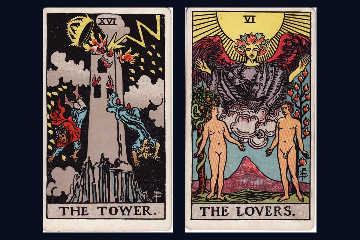
Then the Tower flips and red becomes fire. It licks upward from the windows, it cracks the crown off the top, it lights the falling bodies from behind. This red destroys. Same hue across three cards. Completely different function each time.
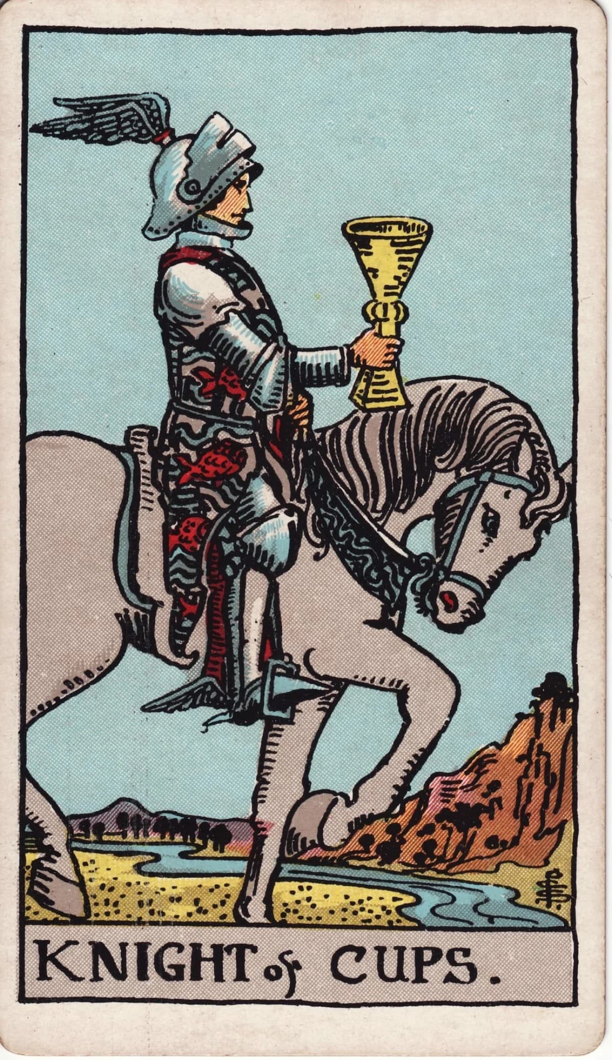
Here's one more, easy to miss. The 8 of Cups shows a cloaked figure walking away from eight stacked cups. On the figure's feet: red boots. Not dramatic, not consuming the frame. Just a quiet detail that says everything. That's the red of courage in retreat, the heat it takes to leave something you built.


The color grammar of tarot gets established early. Cards I and II of the Major Arcana, The Magician and The High Priestess, set up a warm/cool polarity that runs through the entire deck. The Magician's red and gold against The High Priestess's blue and silver. Active and receptive. Solar and lunar. This isn't decoration. It's a structural argument about how energy moves, laid out in the first two numbered cards you encounter.


The High Priestess's blue is specific: cool, still, deep as a lake you can't see the bottom of. It's the blue of receptivity, of knowing something without being able to explain how you know it. But blue doesn't always mean that in this deck. Pull any Swords card with a storm scene and you'll find a grey-blue that makes your stomach tighten. That's anxious blue. Overthinking blue. The color of a sky that won't commit to rain or clearing.
Andrew Elliot's Color-in-Context Theory backs this up. His research showed the same red shifts from threatening to inviting depending on the surrounding context. The color has no fixed meaning. The situation rewrites it. That's what's happening when your body responds differently to red on The Emperor versus red on The Tower.
These assignments aren't random, either. The Golden Dawn tradition mapped planets to colors with real intention. The Empress carries Venus's green, lush and fertile. The Tower burns with Mars's scarlet. The High Priestess wears the Moon's blue. Whether a deck's designer consciously followed these correspondences or simply absorbed them through the tradition, the planetary palette keeps showing up.
Gold works this way too. On The Sun card, it floods the frame, generous and abundant. On the Wheel of Fortune, gold appears in the creatures at the corners, stable and knowing. And black, so often feared in readings, functions as fertile emptiness on the Death card but as confinement in the 8 of Swords. Every color shapeshifts depending on the different combinations it falls into.
Pull your last three readings out of memory. Count the warm-dominated cards versus the cool-dominated ones. That ratio, the overall temperature of what kept coming up for you, might tell you something your individual card meanings didn't.
Tarot color meanings at a glance
| Color | Association | Common meanings |
|---|---|---|
| Red | Fire / Mars | Passion, willpower, authority, warning, courage |
| Blue | Water / Moon | Intuition, receptivity, calm, anxiety (grey-blue), the unconscious |
| Gold / Yellow | Sun / Air | Consciousness, abundance, clarity, intellect, joy |
| Green | Earth / Venus | Growth, fertility, healing, nature, abundance |
| White | Spirit / Purity | New beginnings, truth, spiritual illumination, innocence |
| Black | Saturn / Void | Mystery, fertile emptiness, confinement, the unknown, transformation |
| Purple | Jupiter / Neptune | Royalty, spiritual authority, divination, higher knowledge |
| Orange | Fire-Air / Sun | Vitality, creativity, ambition, enthusiasm, kinetic energy |
| Silver / Grey | Moon / Air | Reflection, ambiguity, detachment, dreaminess |
These are tendencies, not fixed rules. A color's meaning always shifts with the card's context and its neighbors in the spread.
Reading the whole spread's color story
Pull back. Literally. The next time you lay a spread, don't lean in to read the first card. Push your chair back six inches and look at the whole thing as a single image. You're not reading symbols yet. You're reading temperature.
Imagine you've laid a Celtic Cross and the first six cards are all blues and silvers, cool and reflective. Moonlit water. Quiet breath. Then position seven drops a card swimming in ochre and flame. That single warm intruder is where the tension lives. You don't need to know the card's name to feel it. Your eye already snagged on it before your mind caught up. That's color contrast doing the interpretive work for you, and it's more reliable than you think.
Each suit carries a general thermal signature. Cups pull cool and fluid, all those blues and silvers pooling like water in a bowl. Wands run warm and kinetic, pushing reds and oranges that feel like they're leaning forward. Swords go pale and sharp, the greys and icy blues of a winter morning. Pentacles stay earthy and grounded, settling into greens, browns, and golds.
These aren't laws. They're tendencies that shift from deck to deck. But even a basic understanding of tarot color theory gives you a shortcut: you can read a spread's mood by its palette alone, before you've interpreted a single card.
| Suit | Element | Dominant colors |
|---|---|---|
| Wands | Fire | Reds, oranges, warm yellows |
| Cups | Water | Blues, sea greens, silvers |
| Swords | Air | Pale greys, icy blues, whites |
| Pentacles | Earth | Deep greens, browns, golds |


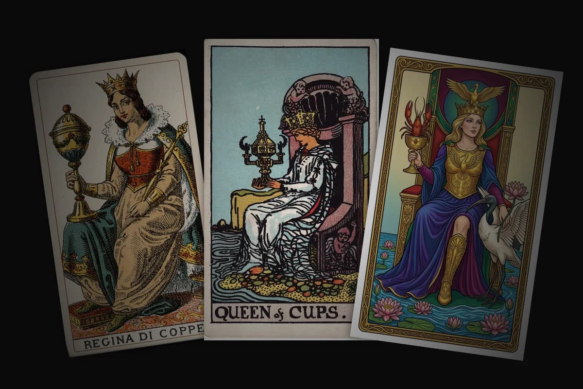
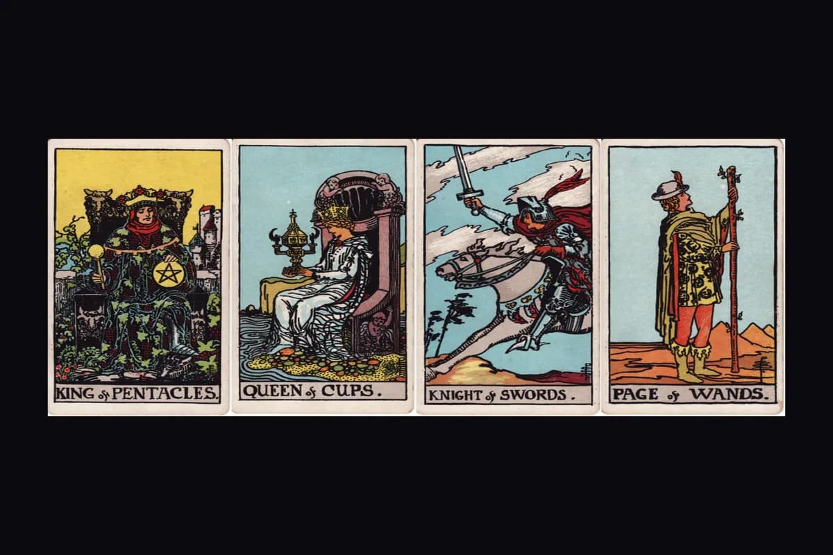
Those four Queens tell the story at a glance. Same rank, same compositional role, completely different thermal weight. Lay the Queen of Cups next to the Queen of Wands and the blue looks almost arctic. Lay her next to the Queen of Swords and suddenly that same blue feels warmer, softer. A golden card next to deep blue looks warmer than the same golden card next to orange. The neighbors rewrite the message.
Try this as a concrete exercise. Next time you lay a spread, unfocus your eyes for a moment. Let the images blur until only the colors remain. Is the reading cool and withdrawn, or warm and urgent? Where does one card break the pattern? That outlier is often where the reading's real tension lives. The spread is a palette, and the card that disrupts it is doing the most work.
Your colors, your reading
Here's something nobody tells you about reading tarot for years: you stop seeing the colors.
It sounds wrong. You'd think experience sharpens perception. But what actually happens is that the interpretive layer becomes a screen between you and the card's visual information. You flip the High Priestess and your mind goes straight to "intuition, mystery, the unconscious." You've stopped noticing the particular blue of her robes, the near-black red of the pomegranates behind her. You've developed color blindspots. The meanings you've memorized have replaced the colors that taught you those meanings in the first place.
Returning to raw color response after years of reading is actually harder than learning card meanings was. That's the counterintuitive truth. Beginners have an advantage here. They haven't yet built the intellectual shortcut that lets them skip past what the card looks like to get to what the card means.
So go back. You started this piece thinking about a card that stopped you once, a card whose colors hit you before its name did. Now you know why. Your nervous system was reading color while your mind was reaching for keywords. The perceptual response came first. It always does. Everything here, the mineral pigments, the simultaneous contrast, the thermal signatures, is just the explanation for something your body already understood.
If you designed your own deck, what color would you leave out? That absence would tell a reader as much as anything you included.
Questions readers ask about tarot card color symbolism
What does the color red mean in tarot cards?
Red rarely means just one thing. On The Emperor, red robes signal authority and structured power. On the Three of Swords, that same red appears as a bleeding heart, pointing to raw emotional pain rather than strength. The Tower's red flames mark sudden destruction. What ties these together is intensity. Red always raises the stakes of a card. It tells you something is urgent, whether that's desire, anger, willpower, or warning. When red dominates a card in your spread, pay attention to what's at risk.
Which colors belong to each tarot suit?
Each suit carries a general color palette through its elemental association. Wands correspond to fire and lean toward oranges, reds, and warm yellows. Cups are tied to water, which brings blues, sea greens, and silver tones. Swords belong to air and favor cool grays, pale blues, and stark whites. Pentacles connect to earth through deep greens, browns, and gold. Individual cards break from their suit's palette when the card's meaning demands it, and that contrast itself is a signal worth reading.
How do you read colors in a tarot spread?
Start by stepping back and looking at the whole spread as a single image before reading individual cards. Notice the overall temperature: is it dominated by warm tones (reds, oranges, golds) or cool tones (blues, silvers, grays)? Then look for the outlier, the one card whose color breaks the pattern. That card is often where the reading's real tension lives. The ratio of warm to cool cards across a spread can tell you something your individual card meanings did not.
Do colors mean the same thing in every tarot deck?
No. Color meaning shifts between decks because each artist brings different traditions, cultural associations, and personal instincts to the palette. The Rider-Waite-Smith deck uses Golden Dawn color correspondences as scaffolding, but Pamela Colman Smith made significant departures from those assignments. A Marseille deck uses a tight five-color palette dictated by printing technology. A modern indie deck may invent its own color language entirely. The underlying emotional associations (red as intensity, blue as stillness) tend to hold across traditions, but the specific application varies.
What does a yellow background mean on a tarot card?
Yellow and gold backgrounds typically signal solar energy, consciousness, and abundance. On The Sun card, golden light floods the entire frame to convey joy and vitality. On the Wheel of Fortune, gold appears in the corners as stable, knowing presence. In the Golden Dawn system, yellow connects to Mercury (communication, intellect) and gold to the Sun (Tiphareth, the sixth sephirah). When yellow appears as a sky rather than an object, it often marks a moment of clarity or spiritual illumination in the card's narrative.